CONTEXT
Cutting Interaction Complexity by 57% for 1,000+ Institutions Managing $1.3 Trillion in Client Assets
My Role
Lead Product Designer
Team
Product Manager, Tech Lead, QA
Timeline
May 2025 - August 2025 (3 Months)
Tools
Figma, v0, Dovetail, Pendo, User Interviews
Business Model
SaaS, Financial Technology
As the Product Designer on the Portfolio Analytics Consumer Team, I…
As the Product Designer on the Portfolio Analytics Consumer Team, I…
Led design efforts for rebuilding the report creation and bulk filtering experiences
Conducted 14+ user research sessions with financial analysts, loan officers, and chief lending officers
Pioneered AI integration in our design process using V0 by Vercel and Figma Make
Collaborated closely with PM and engineering to navigate technical constraints and business priorities
Established design review processes to ensure quality delivery despite handoff challenges
THE PROBLEM
Tedious Workflows Hindering Efficiency
Portfolio Analytics is a critical data backbone for financial institutions, moving users from Excel-based processes to sophisticated data analysis. However, two core aspects of the reporting workflow were impacting the efficiency potential for loan officers, financial analysts, and chief lending officers managing billions in assets:
Portfolio Analytics is a critical data backbone for financial institutions, moving users from Excel-based processes to sophisticated data analysis. However, two core aspects of the reporting workflow were impacting the efficiency potential for loan officers, financial analysts, and chief lending officers managing billions in assets:
Cumbersome Report Building
Cumbersome Report Building
Creating reports from scratch is one of the most commonly used features, but the experience was clunky and cognitively heavy. Inconsistent UI, unintuitive grouping, no previews, and excessive clicks made this vital experience inefficient.
Creating reports from scratch is one of the most commonly used features, but the experience was clunky and cognitively heavy. Inconsistent UI, unintuitive grouping, no previews, and excessive clicks made this vital experience inefficient.
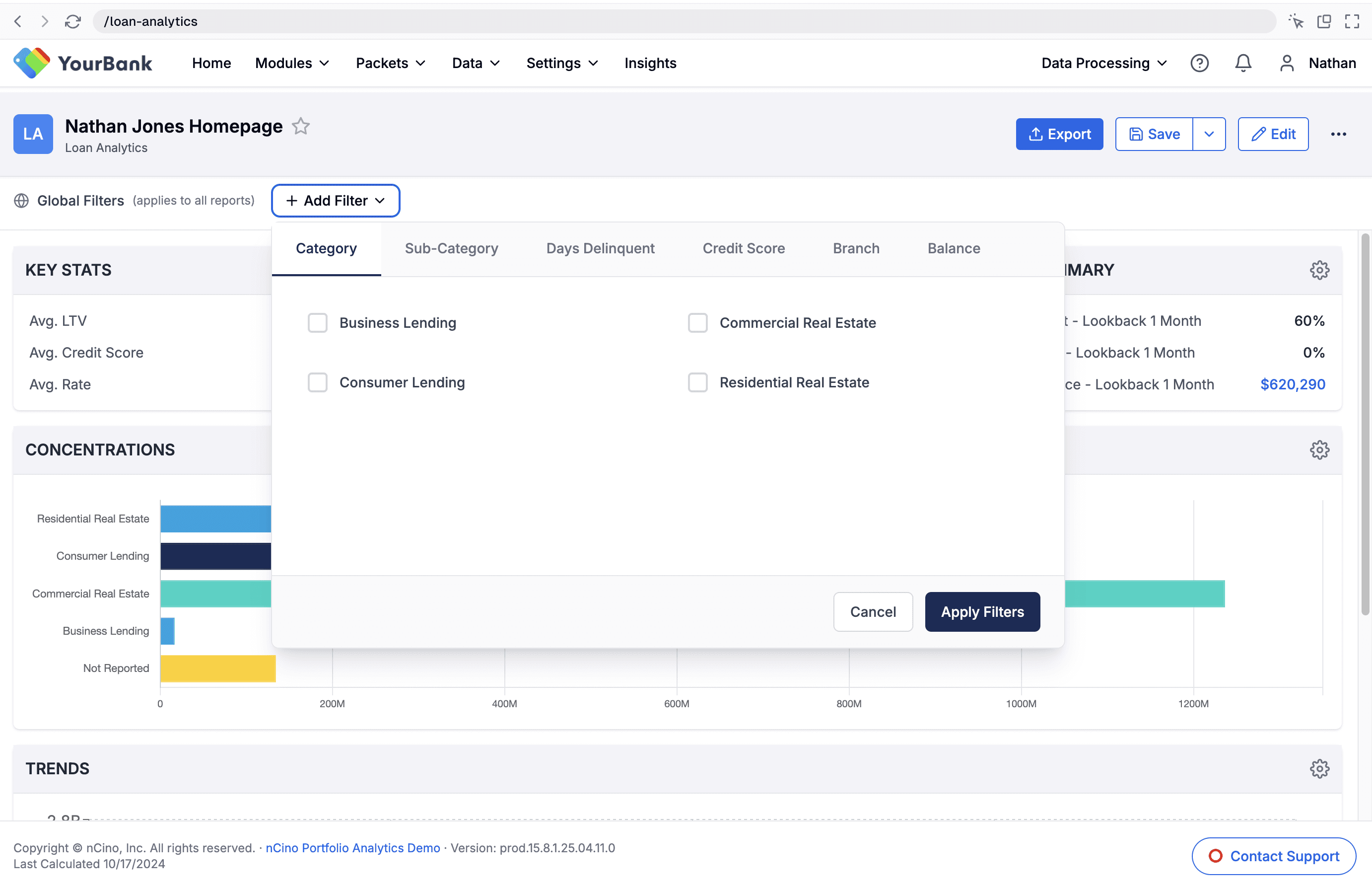
Hidden Filter Capabilities
Hidden Filter Capabilities
The bulk filter, which applies filters to all report elements at once, was buried in the interface—leading 72% of users to spend 3x longer manually applying filters. Being in outdated code, there was an opportunity to rebuild it and surface this time-saving feature.
The bulk filter, which applies filters to all report elements at once, was buried in the interface—leading 72% of users to spend 3x longer manually applying filters. Being in outdated code, there was an opportunity to rebuild it and surface this time-saving feature.
RESEARCH & INSIGHTS
Understanding Our Users: Analysts Under Pressure
Through 14+ user interviews with financial professionals, I uncovered the following key insights:
Through 14+ user interviews with financial professionals, I uncovered the following key insights:
01
Desire for Real-Time Preview
Users want real-time preview capabilities when building reports, even if using dummy data, to avoid the current "guess and check" workflow that requires running full reports to verify formatting.
“Any preview is better than no preview”
Users want real-time preview capabilities when building reports, even if using dummy data, to avoid the current "guess and check" workflow that requires running full reports to verify formatting.
“Any preview is better than no preview”
Report Creation Patterns
The “Start From Scratch” feature is often the first thing a user does when they open the product, making it a vital aspect of their workflow. Their goal is to get in and get out as fast as possible.
“What's the quickest way I can get what I need?”
The “Start From Scratch” feature is often the first thing a user does when they open the product, making it a vital aspect of their workflow. Their goal is to get in and get out as fast as possible.
“What's the quickest way I can get what I need?”
02
Low Feature Engagement = Lost Time
Our bulk filtering feature could improve user efficiency by 67%, but it was buried 4 clicks deep. 72% of the users we interviewed were unaware of this capability, manually adding filters that could be applied in 20 seconds instead of minutes.
“I think I have noticed that before. I don't honestly know that I've ever used it though.”
03
Misunderstood Purpose
Users had varying perceptions about what the report-level filter actually did.
“Maybe that's why I don't use it, because I don't want it to impact every element.”
Users had varying perceptions about what the report-level filter actually did.
“Maybe that's why I don't use it, because I don't want it to impact every element.”
04


pROCESS
From v0 Prototype to High-Fi Design in Figma
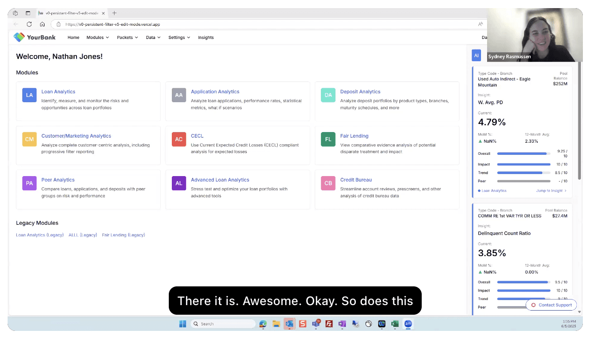
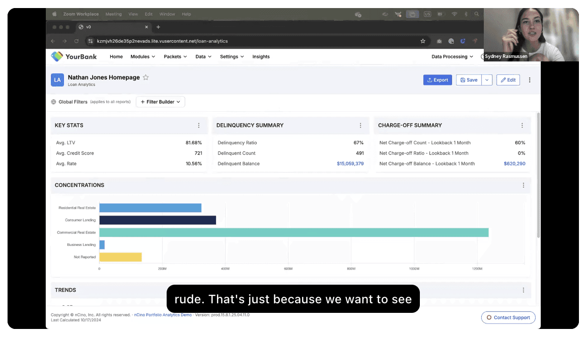
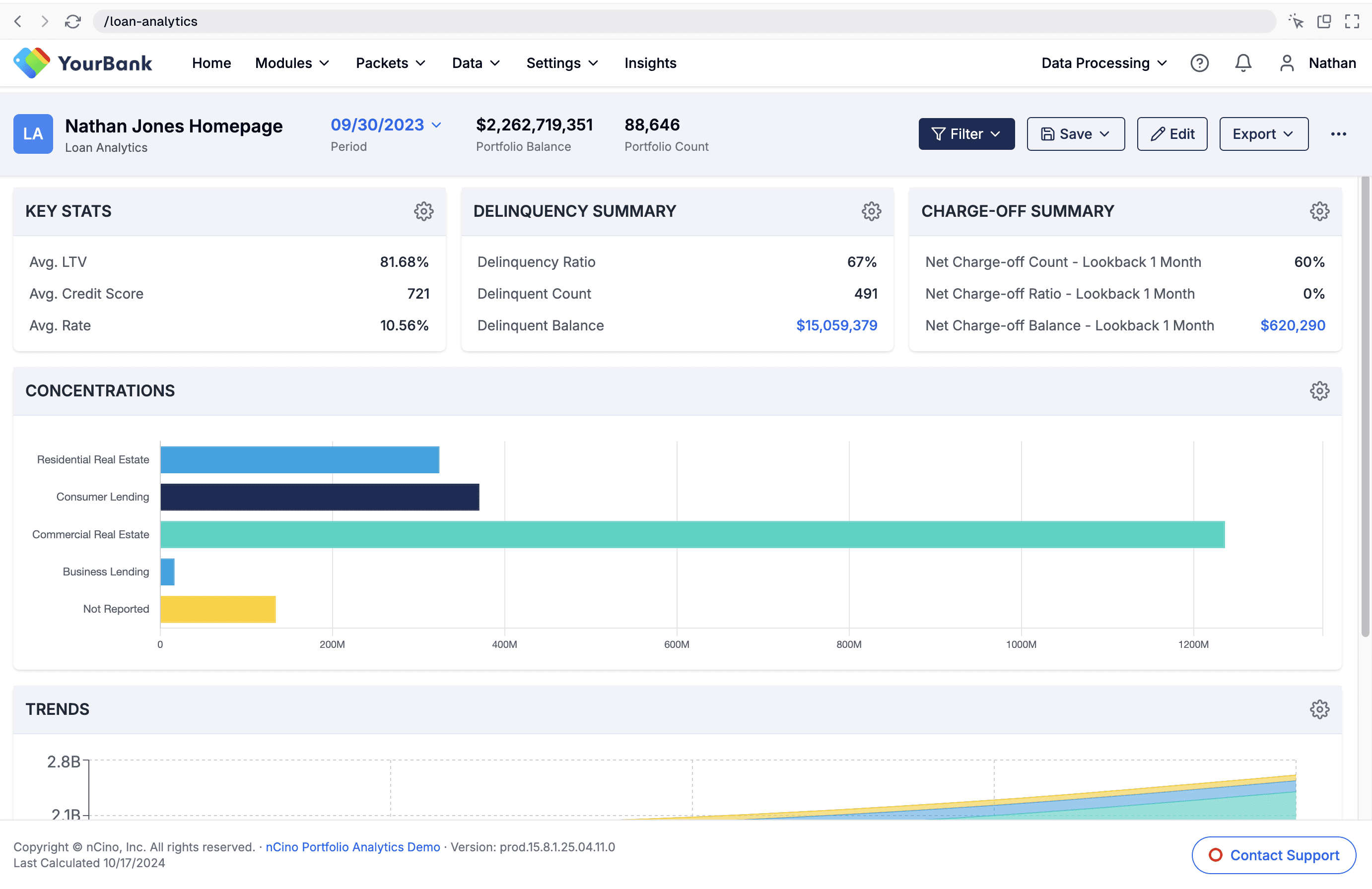
We shipped the improved report builder experience first. At the time, we experimented with handing off the AI-generated v0 prototype directly to engineering—it felt efficient since it was already built and we weren’t using an official Figma design system.
We shipped the improved report builder experience first. At the time, we experimented with handing off the AI-generated v0 prototype directly to engineering—it felt efficient since it was already built and we weren’t using an official Figma design system.
But the result didn’t match our vision. I ended up recreating the design in Figma and writing multiple cosmetic update tickets, which slowed down development more than expected.
But the result didn’t match our vision. I ended up recreating the design in Figma and writing multiple cosmetic update tickets, which slowed down development more than expected.
So for the Bulk Filter, we shifted gears: I delivered a polished Figma prototype instead. It made collaboration easier, ensured visual consistency, and saved engineering time.
So for the Bulk Filter, we shifted gears: I delivered a polished Figma prototype instead. It made collaboration easier, ensured visual consistency, and saved engineering time.
Here’s how the bulk filter feature evolved…
Here’s how the bulk filter feature evolved…
1 - v0 Prototype
Header button, drop down
1 - v0 Prototype
Filter button placed in header for prominent positioning with drop down to open filter options
1 - v0 Prototype
Header button, drop down
2- v0 Prototype
Dedicated Banner, drop down
2 - v0 Prototype
Dedicated banner for filtering beneath the report header with a drop down
2- v0 Prototype
Dedicated Banner, drop down
3- v0 Prototype
Dedicated Banner, Modal
3 - v0 Prototype
Dedicated banner for filtering but the filter button opens a modal to select filter options
3- v0 Prototype
Dedicated Banner, Modal
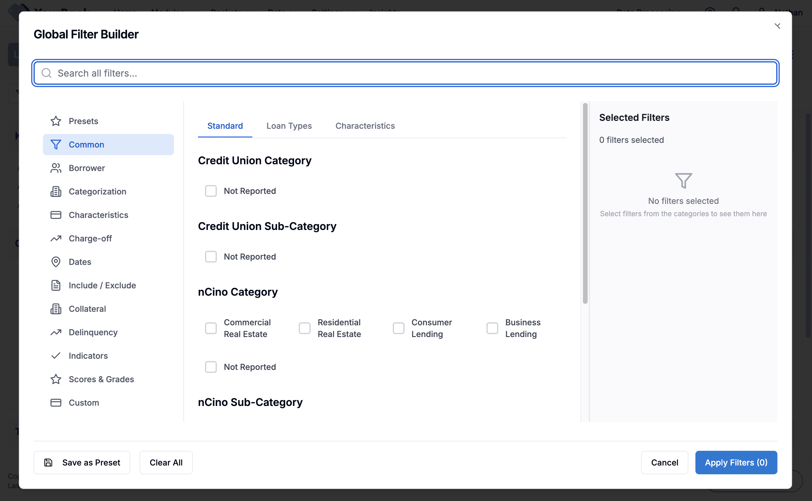
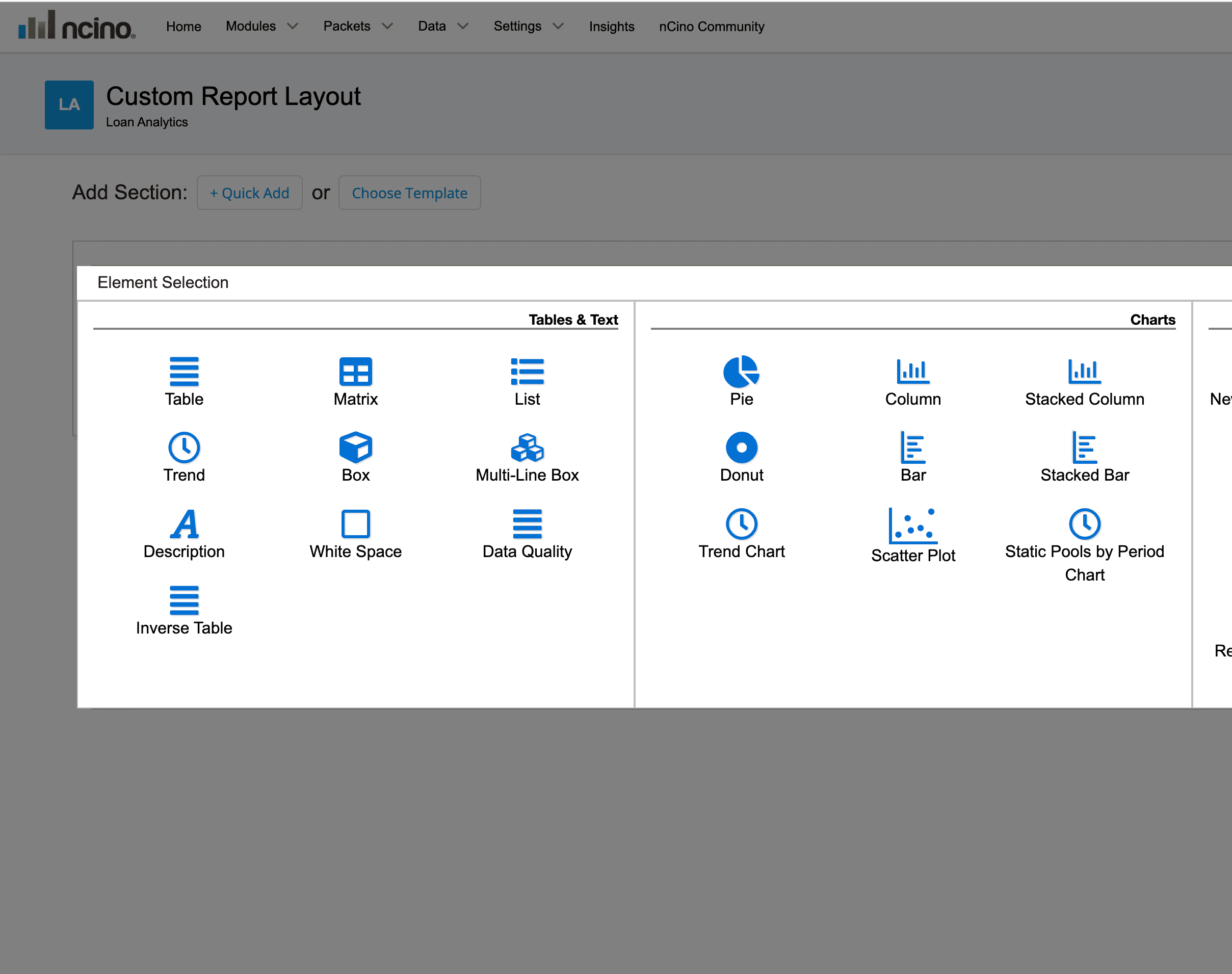
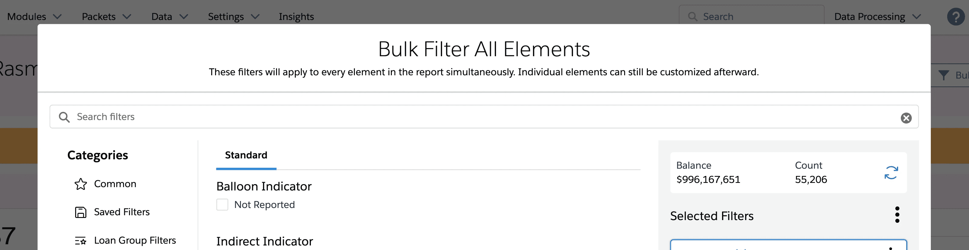
4 - v0 Prototype
Modal with Multiple Filter Groups
4 - v0 Prototype
In this filter modal, the user can create multiple filter groups for complex filtering
4 - v0 Prototype
Modal with Multiple Filter Groups
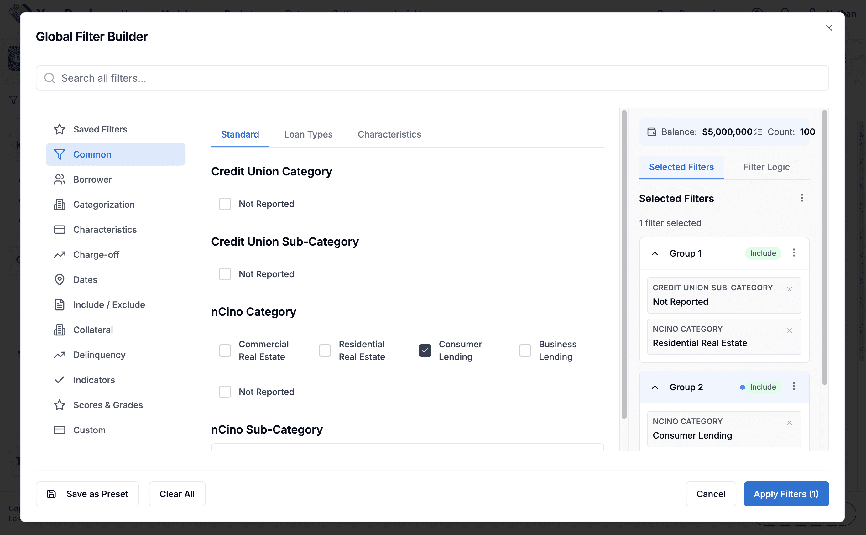
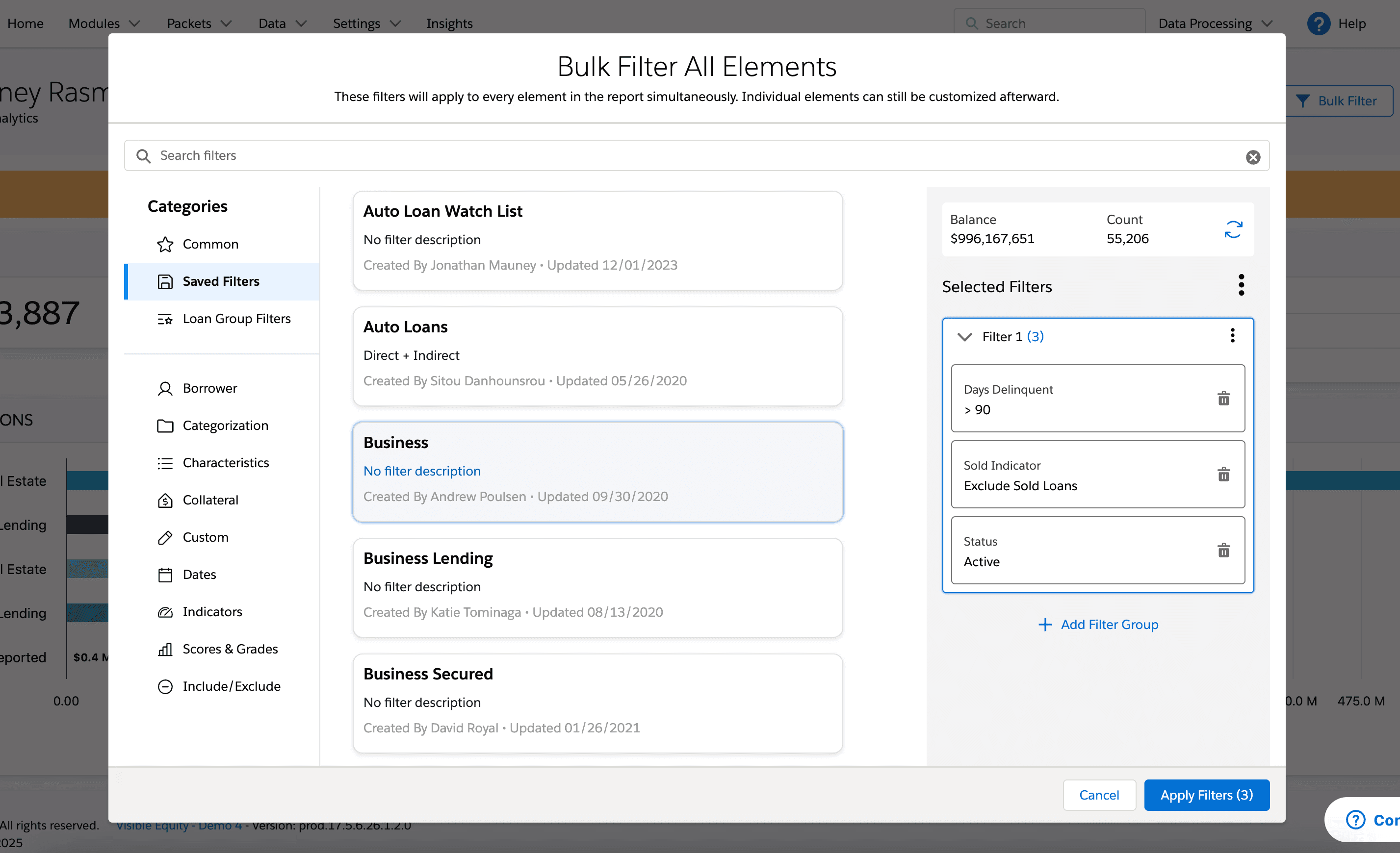
5 - Hi-Fi Figma
Header Button & Modal with Filter Groups
5 - High-Fidelity Figma Design
Ultimately landed on a Bulk Filter button in the header that opens a large filtering modal to allow users to apply complex filtering logics
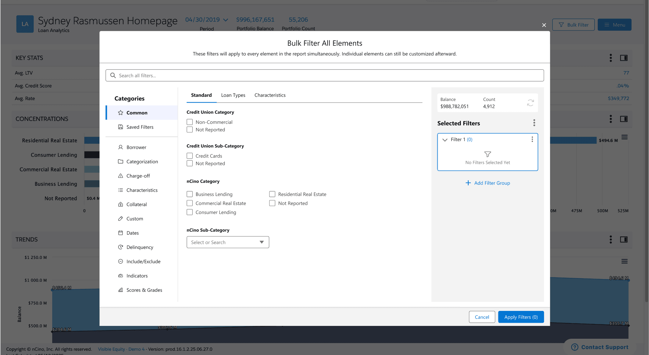
5 - Hi-Fi Figma
Header Button & Modal with Filter Groups
SOLUTION
Streamlining Complex Workflows Through AI-Accelerated Design
My final designs reflect what I learned from previous iterations and what I heard from users: they wanted clarity, control, and fewer steps. Here’s how I brought that to life.
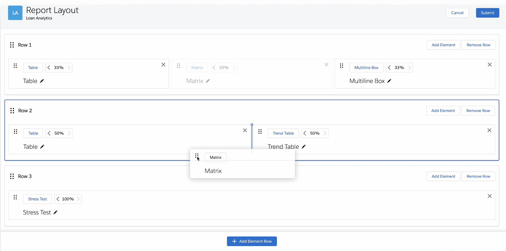
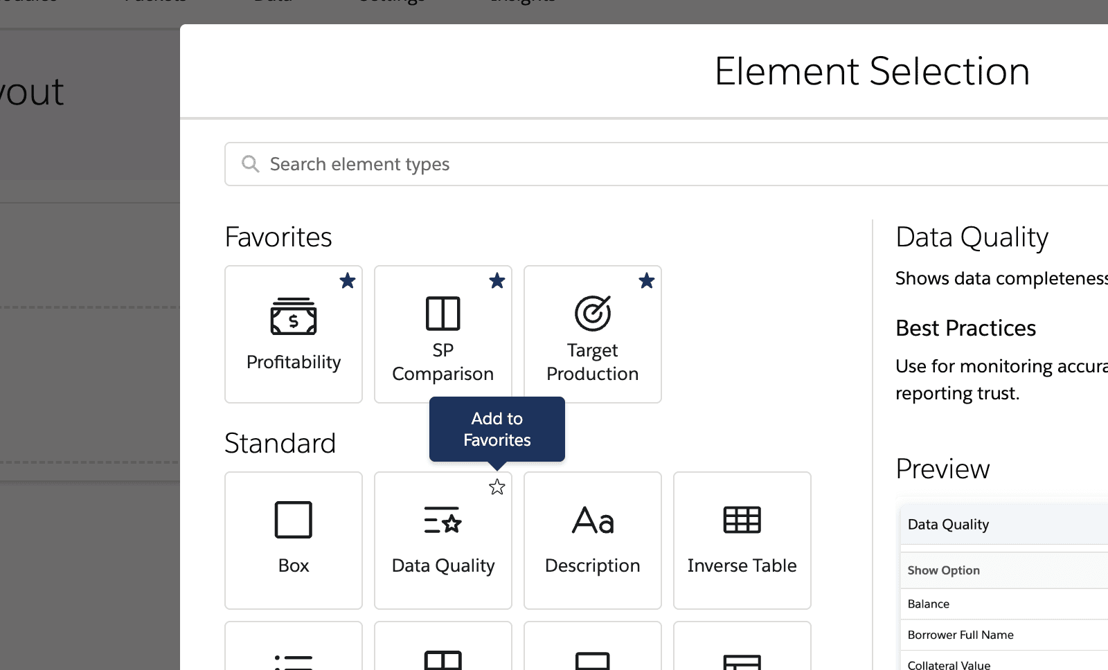
Key Design Decisions for Report Building Experience
Key Design Decisions for Report Building Experience
Element Preview
Before
No element preview or description to inform user decisions
After
Preview and description of each element option
Before
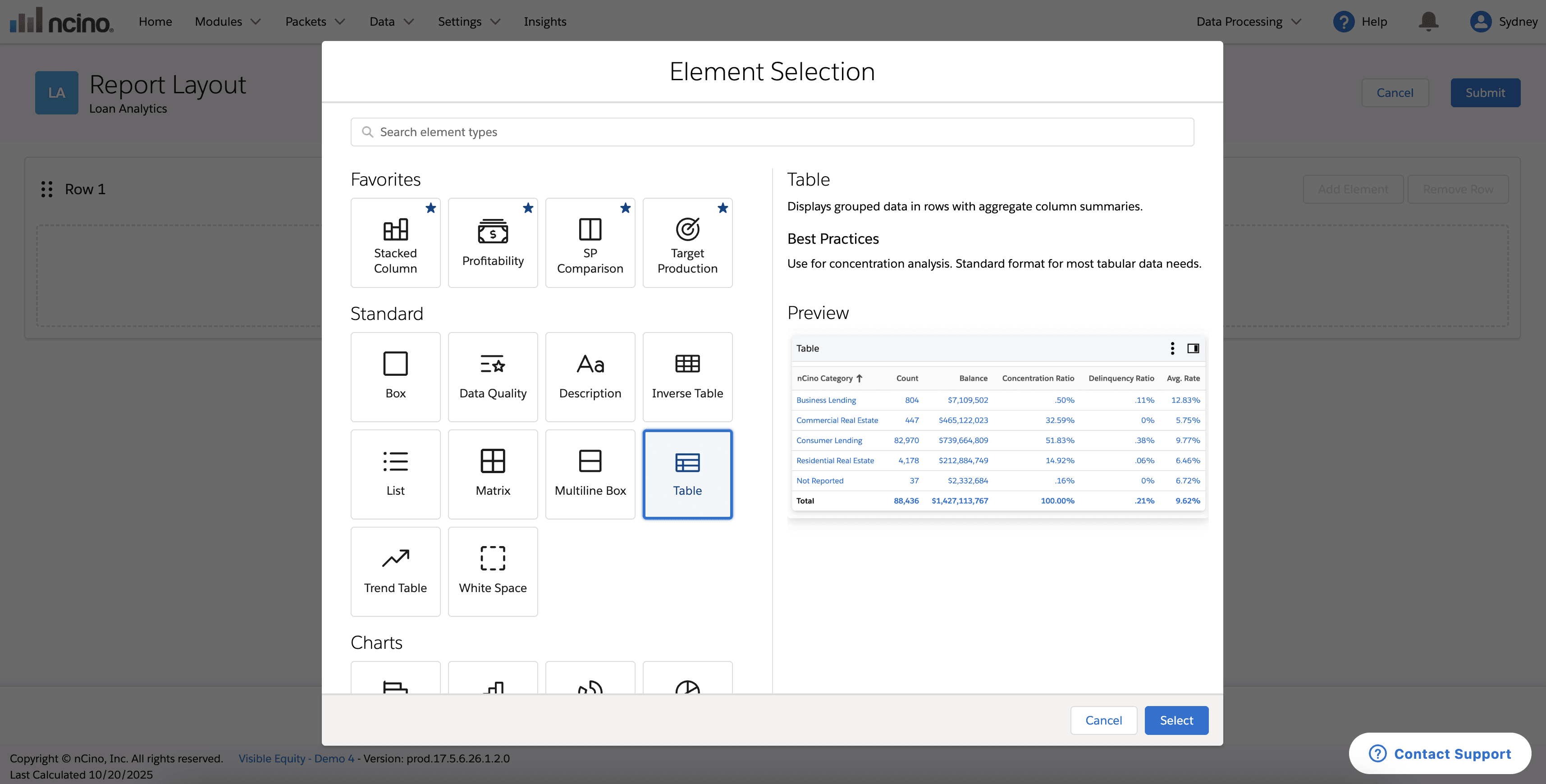
After
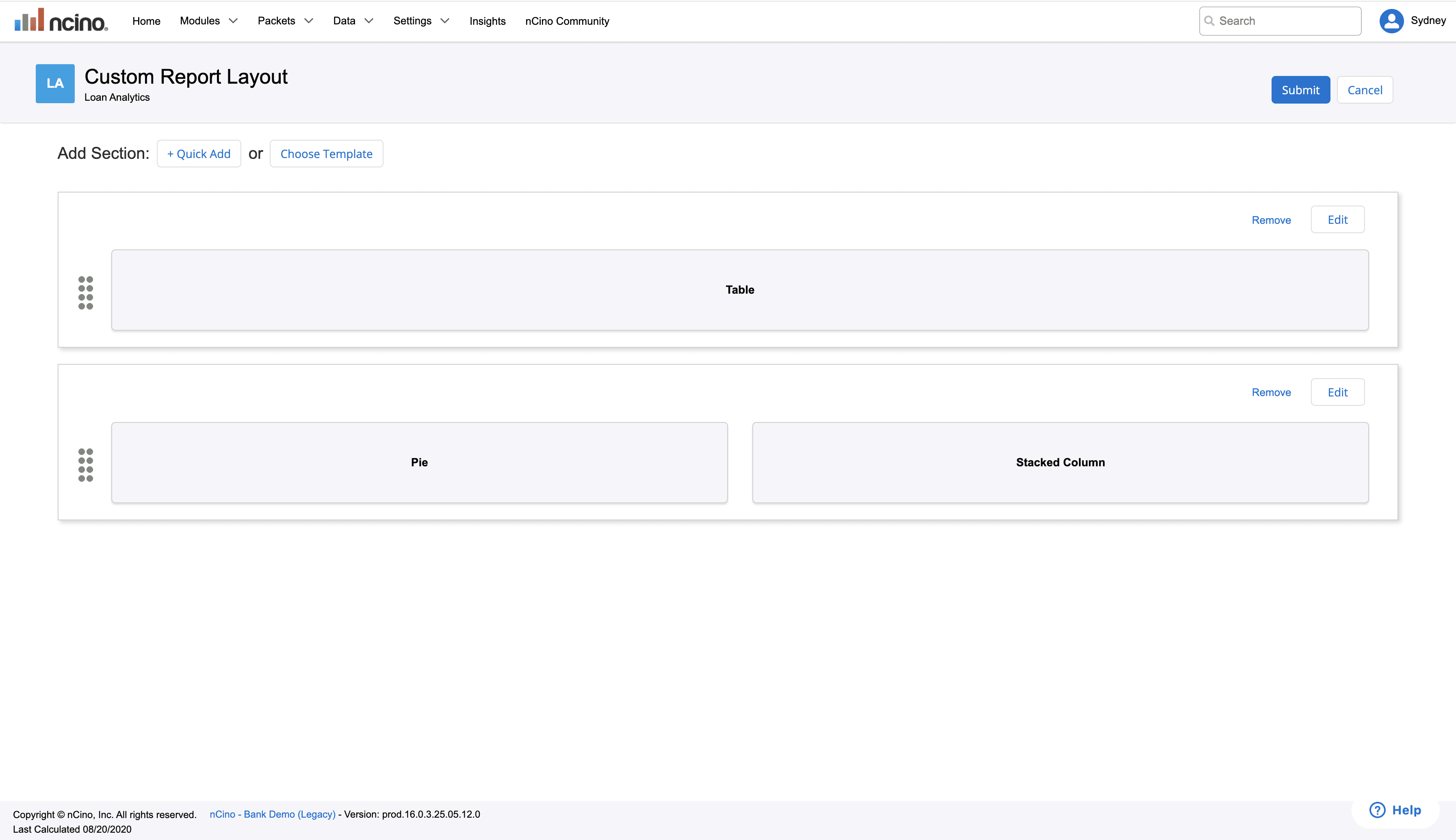
Customization
Before
Static elements with unchangeable names
After
Drag and drop and rename elements
Preferred by 90% of users in A/B testing
Before
After
Findability
Before
No search, common section, repeated icons
After
Search bar, favorites section, distinct icons
Before
No element preview or description to inform user decisions
After
Preview and description of each element option
Before
Static elements with unchangeable names
After
Drag and drop and rename elements
Preferred by 90% of users in A/B testing

Findability
Before
Did not have search, had common section, and repeated icons
After
Search bar, favorites section, distinct icons
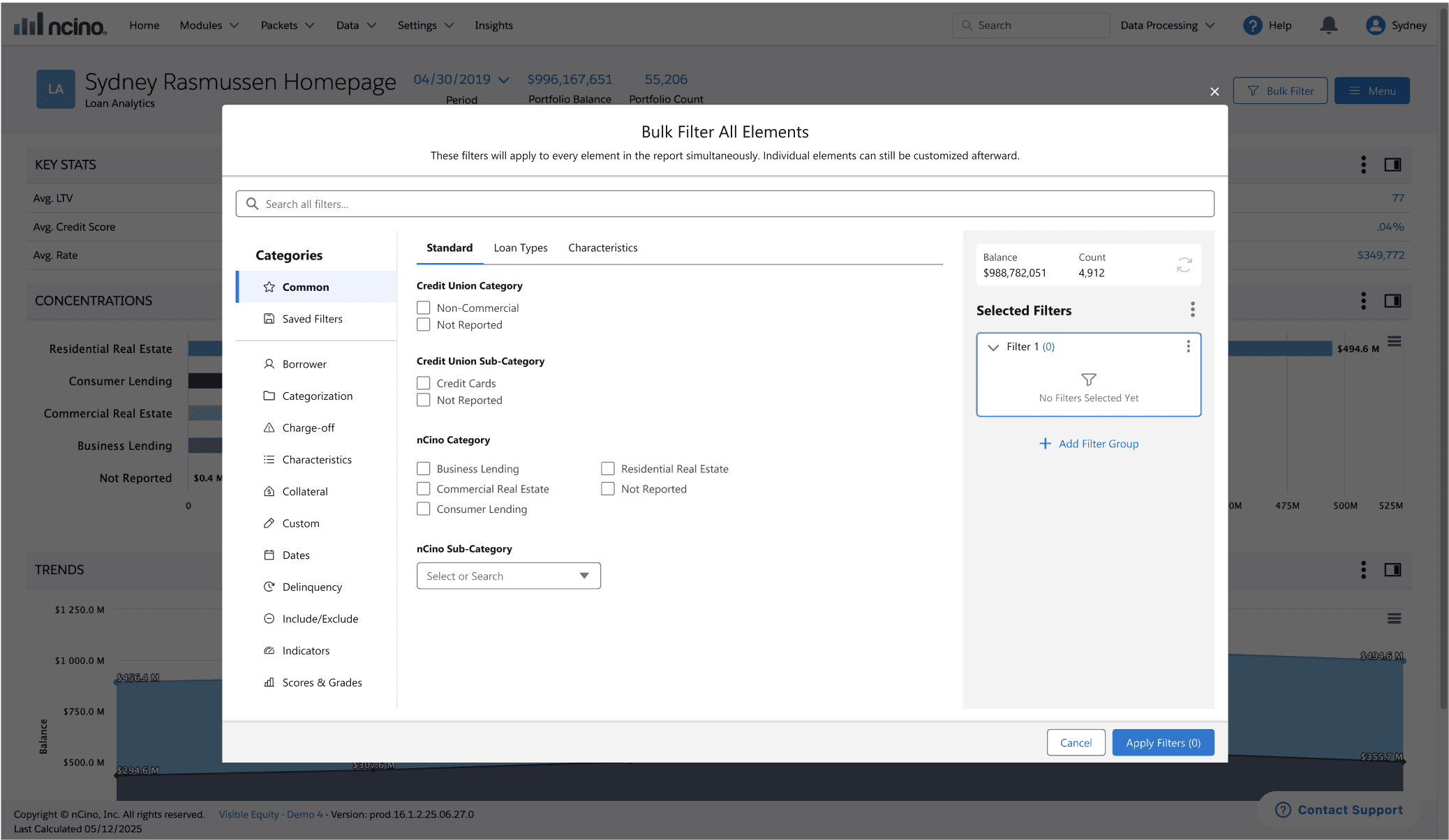
Key Design Decisions for Bulk Filter Feature
Key Design Decisions for Bulk Filter Feature
Key Design Decisions for Bulk Filter Feature
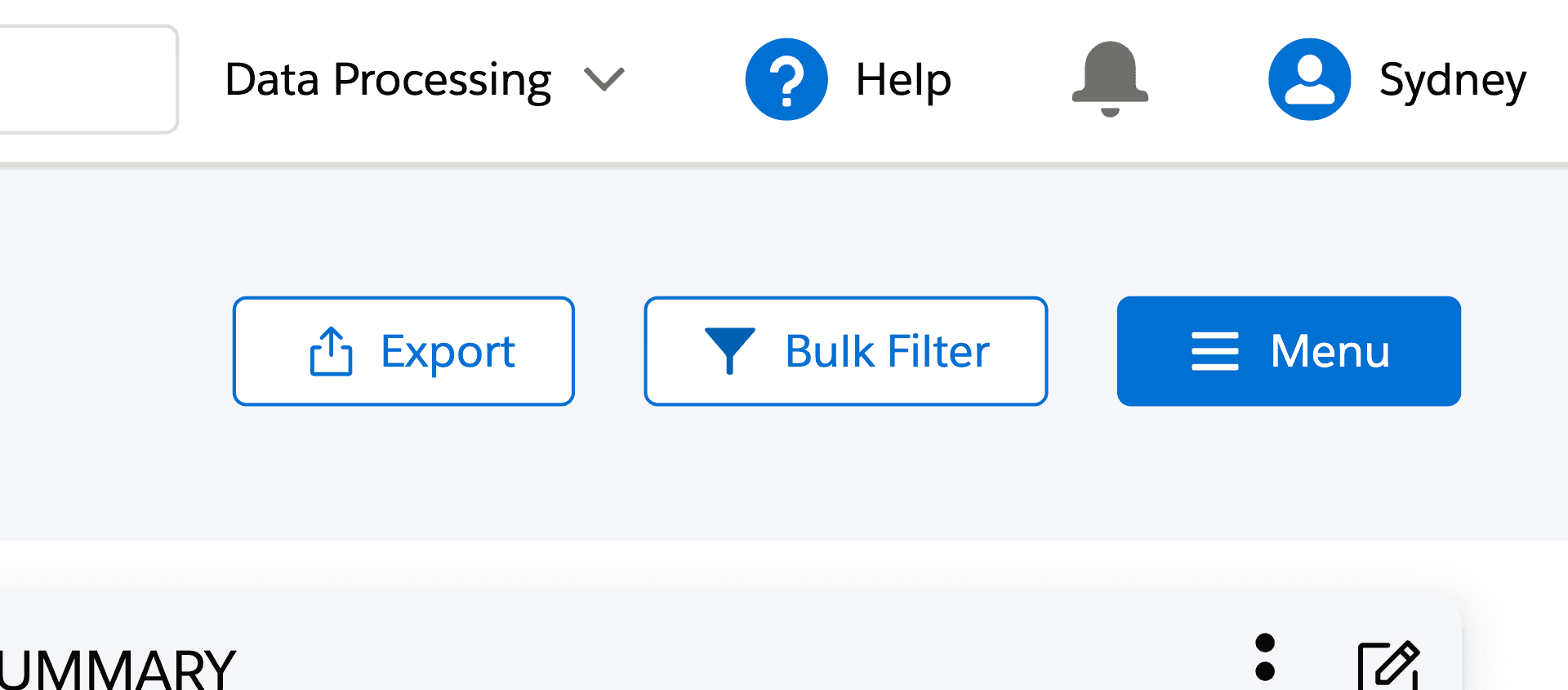
Increased Visibility
Increased Visibility
Before
Before
Buried 4 clicks deep in the interface
Buried 4 clicks deep in the interface
Buried 4 clicks deep
After
After
Prominent homepage placement
Prominent homepage placement
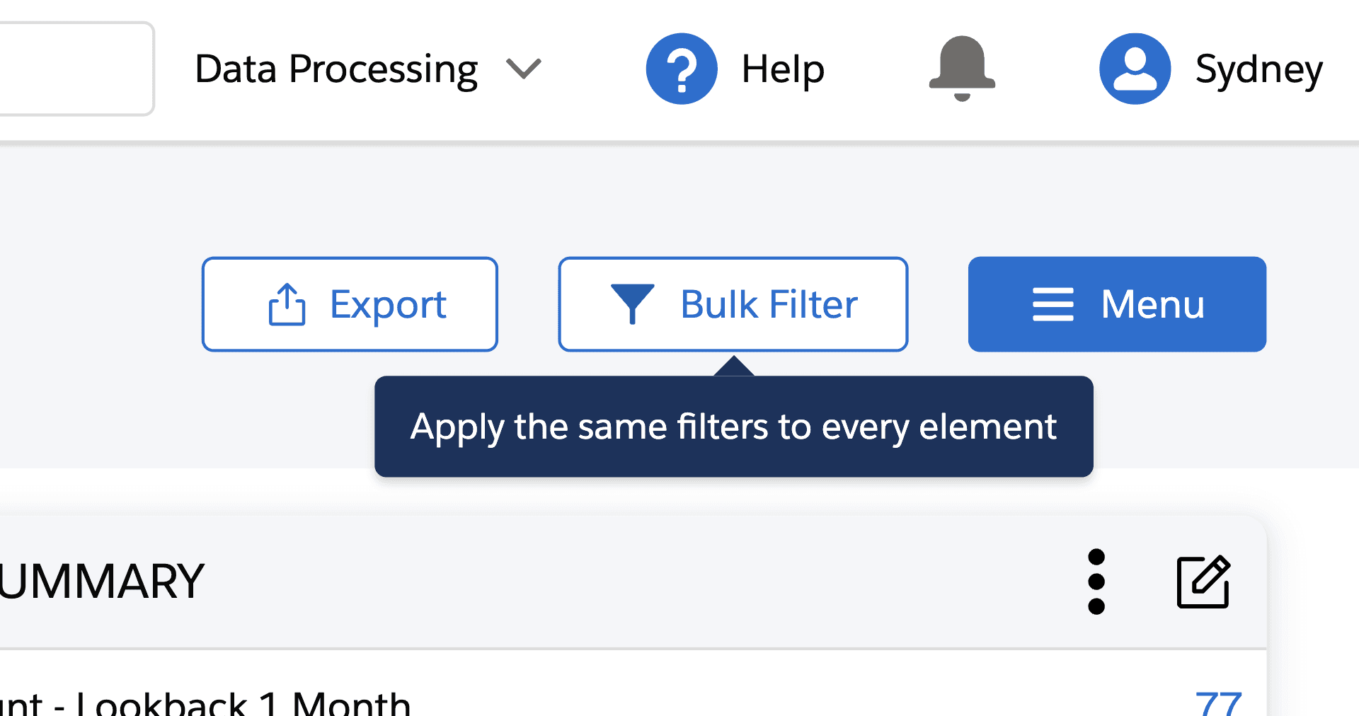
Increased Clarity
Increased Clarity
Before
Before
No explanation or context clues
No explanation or context clues
After
After
Hover tooltip & improved microcopy
Hover tooltip & improved microcopy
Improved Usability
Improved Usability
Before
Before
Context switching, disconnection from reporting experience
Context switching, disconnection from reporting experience
After
After
Modal-based approach & saved filters tab for faster filtering
Modal-based approach & saved filters tab for faster filtering
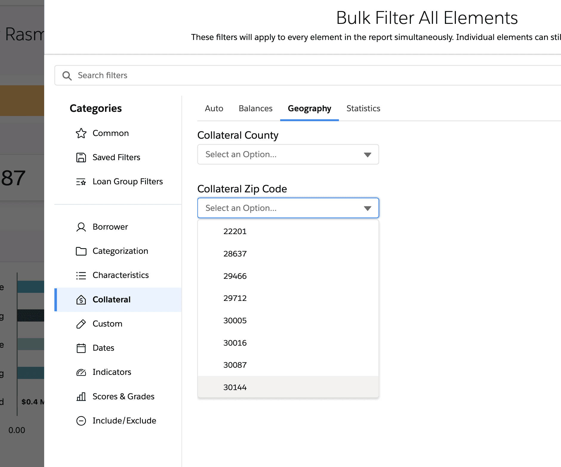
Before: Endless Scrolling
Before: Endless Scrolling
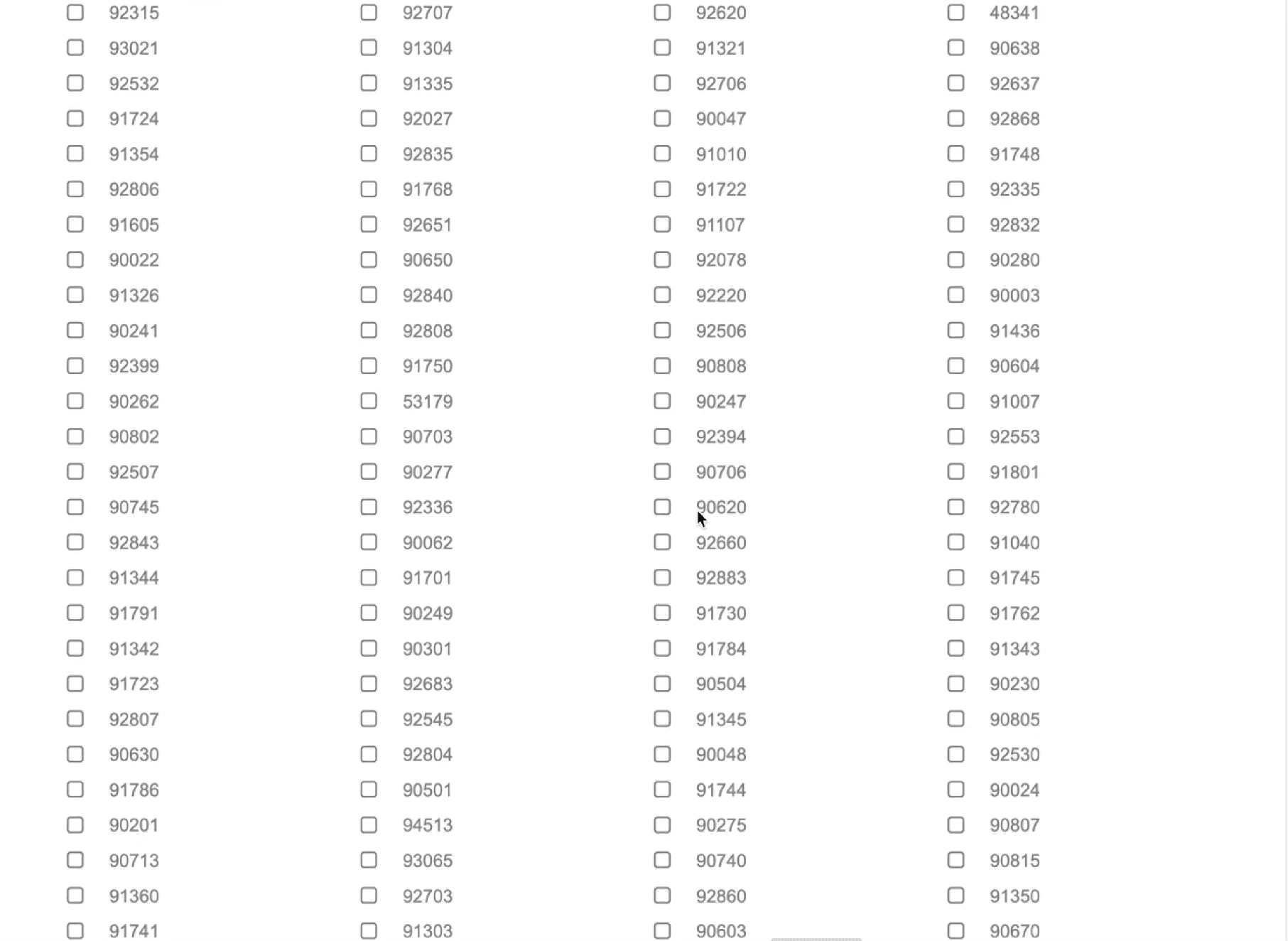
After: Comboboxes for lists with 10+ items
After: Comboboxes for lists with 10+ items
SOLUTION
Streamlining complex workflows through AI-accelerated design
My final designs reflect what I learned from previous iterations and what I heard from users: they wanted clarity, control, and fewer steps. Here’s how I brought that to life.
Key Design Decisions for Report Building Experience
Element Preview
Element Preview
IMPACT
From Pain Points to Power Features
Key Outcomes
Key Outcomes
The redesigned Bulk Filter and report building experience launched in September 2025. This wasn't just a UI refresh—it solved a real pain point that affects how our client base creates reports and makes critical business decisions.
The redesigned Bulk Filter and report building experience launched in September 2025. This wasn't just a UI refresh—it solved a real pain point that affects how our client base creates reports and makes critical business decisions.
40%
Click Reduction
Only 3 clicks to add a new element when building a report
3x
Faster Filtering
Users can now apply filters to all elements simultaneously
51.5%
Adoption
Majority of customers engaged within 90 days indicating strong discoverability
“Sydney took complete ownership of the "Start from scratch" experience redesign, a critical workflow used daily by financial analysts and Chief Lending Officers across our client base. Partnering closely with her product manager David, she conducted exceptionally thorough user research that uncovered key insights about how users navigate complex data interactions.
Sydney also led the design for our global filters experience within loan analytics, a technically complex challenge that she's approached with remarkable independence and strategic thinking. What consistently impresses me is her ability to balance user advocacy with business constraints, demonstrating an understanding of product strategy that typically takes years to develop.”

Nathan Jones
Nathan Jones
-Product Design Manager @ nCino
-Product Design Manager @ nCino
REFLECTION
Navigating Ambiguity, Overcoming Challenges
This project pushed me to navigate multiple constraints while maintaining design quality and user experience.
This project pushed me to navigate multiple constraints while maintaining design quality and user experience.
🤖 AI Integration
🤖 AI Integration
Balancing AI efficiency with design quality, managing inconsistent outputs, and development handoff issues.
Balancing AI efficiency with design quality, managing inconsistent outputs, and development handoff issues.
What I Did:
What I Did:
Used AI tools such as Claude, Figma Make, and v0 for early-stage ideation and divergent thinking
Applied human judgment for all final design decisions
Built final deliverables in Figma for pixel-perfect handoff
Validate AI concepts with user research
Used AI tools such as Claude, Figma Make, and v0 for early-stage ideation and divergent thinking
Applied human judgment for all final design decisions
Built final deliverables in Figma for pixel-perfect handoff
Validate AI concepts with user research
🎨 Design System Fragmentation
🎨 Design System Fragmentation
There was no official design system for our product. Much of the existing UI was built in old code and “Frankenstein-ed” together using mismatched SLDS 1 components. The new company-wide design system wasn't implementable yet, creating handoff challenges and limiting design deliverables.
There was no official design system for our product. Much of the existing UI was built in old code and “Frankenstein-ed” together using mismatched SLDS 1 components. The new company-wide design system wasn't implementable yet, creating handoff challenges and limiting design deliverables.
What I Did:
What I Did:
Prioritized consistency over personal aesthetic preferences to reduce cognitive load and development friction.
Built necessary components in Figma
Used SLDS 1 to ensure the most precise, realistic hand-off possible
Worked with PM to create detailed acceptance criteria for hand-off
Prioritized consistency over personal aesthetic preferences to reduce cognitive load and development friction.
Built necessary components in Figma
Used SLDS 1 to ensure the most precise, realistic hand-off possible
Worked with PM to create detailed acceptance criteria for hand-off
👩🎨 Design’s New Role on the Team
👩🎨 Design’s New Role on the Team
This was the first time my team had its own designer. My developer had only received a Figma file once before, so we had to figure out hand-off workflows from scratch.
This was the first time my team had its own designer. My developer had only received a Figma file once before, so we had to figure out hand-off workflows from scratch.
What I Did:
What I Did:
Developed a hybrid AI + Figma workflow
Delivered organized Figma files so they would be easy to navigate
Implemented design review processes
Collaborated closely with the tech lead to build a shared understanding
Developed a hybrid AI + Figma workflow
Delivered organized Figma files so they would be easy to navigate
Implemented design review processes
Collaborated closely with the tech lead to build a shared understanding
💡Key Learnings
💡Key Learnings
AI as a Design Accelerator
I learned to leverage AI for rapid ideation and prototyping while maintaining design quality through strategic prompt engineering and prototype refinement.
I learned to leverage AI for rapid ideation and prototyping while maintaining design quality through strategic prompt engineering.
Prioritization Under Constraints
Learned to focus on MVP essentials over nice-to-haves, delivering meaningful progress within technical and timeline constraints.
Learned to focus on MVP essentials over nice-to-haves, delivering meaningful progress within technical and timeline constraints.
This experience fundamentally changed how I approach design challenges, proving that AI can accelerate the creative process while human insight remains essential for creating truly user-centered solutions.
This experience fundamentally changed how I approach design challenges, proving that AI can accelerate the creative process while human insight remains essential for creating truly user-centered solutions.
What I’ve Been Working on Since These 2 Enhancements…
Standardized Header Buttons Across the Product
Standardized Header Buttons Across the Product
Noticing inconsistent button styles across the product — from spacing and height to primary/secondary usage — I made a case for improving the visual consistency.
Drawing on the aesthetic-usability effect, a UX principle that suggests users perceive more aesthetic interfaces as more usable, I argued that consistency can impact how credible and intuitive a product feels.
I audited all header button patterns and proposed a clear standard: the Menu button should always be primary, and all others secondary, with consistent spacing and height. I also replaced the outdated "magic wand" Menu icon (a holdover from the pre-AI era) with a more familiar and appropriate hamburger icon.
My manager, who had previously tried to make this change without success, called it a big win.
Before...

After...

Time Period Comparison
Enabling loan officers to directly compare their current portfolio balance with a specific past time period – a feature that didn't previously exist. The final design allows users to select their preferred lookback period and instantly see the comparison right in their dashboard. This gives them greater visibility into their portfolio growth and performance at a glance. I prototyped this experience in v0 and Figma Make to test with our customer success team and ultimately delivered pixel-perfect components I created in Figma.
What's your next big challenge?
What's your next big challenge?
I'd love to help tackle it. Connect with me on LinkedIn or drop me a message below!
I'd love to help tackle it. Connect with me on LinkedIn or drop me a message below!
Other Projects